The idea of web analytics is not new or revolutionary. In the 1990’s nearly every website had a hit counter, an odometer-style counter at the bottom of the page. That was the very beginning of web analytics, simply counting the number of page views a website has had. However, the world of web development has changed substantially over the last 20 years, one of the biggest changes being the wide spread use of JavaScript, which allows us to build functionality into our applications. This means that users now interact with dynamic applications, they no longer just view pages of content, but engage with that content. And of course, web analytics has kept up with these changes, allowing us to record and measure how visitors interact with our site and not just the number of page views.
At Catalyst we fly the open source flag high and use open source tools where ever possible, which is why our analytics tool of choice is Matomo. Matomo is an open source web analytics application that not only allows us to track all of the things you would expect from a web analytics tool, but also allows us to capture user interactions, by defining what we want to track, and how we want to do that.
Going beyond page view analytics
Recently, we employed this idea of measuring user interactions on SmartStart, a website for expectant and new parents. As we built out the functionality, we included the code that would tell Matomo that something had happened on the site. For example, when we created an accordion, an area of content that either expands or closes depending on the user interaction, we also created an object, called an ‘Event’’ that is sent to Matomo via an API. It records which accordion has been opened. By recording these types of user interactions, plus many others, we can start to tell a story about how our users are actually using SmartStart and not just which pages they are visiting.
We have used this data to analyse the user experience of SmartStart and have started to notice some interesting behaviour. The welcome page of SmartStart contains a lot of information, everything from advice on finding a midwife, right through to advice on paying for childcare, and it is displayed in one big scrollable time line. By monitoring user interactions, we can start to see if everyone is actually getting all the information available to them on this one page.
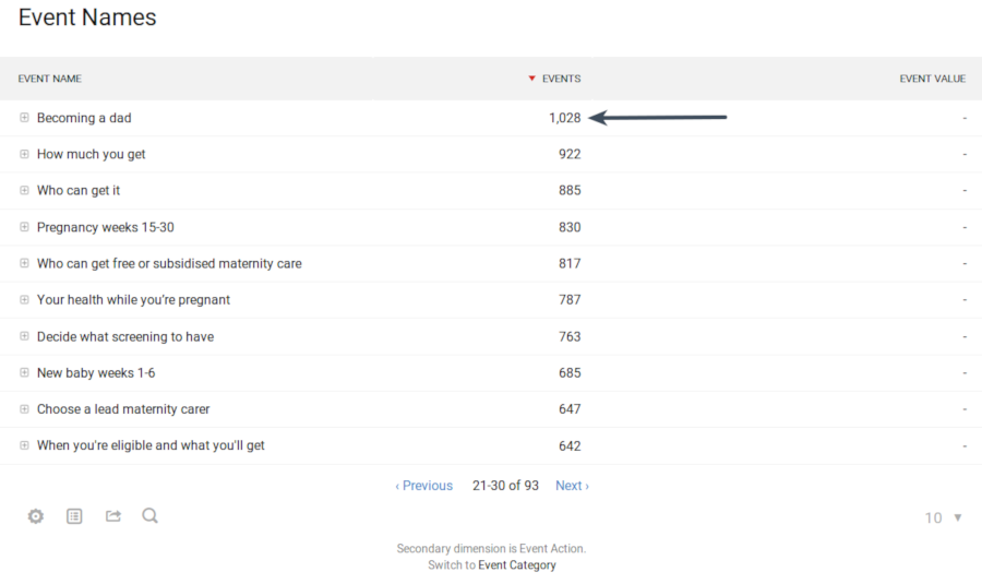
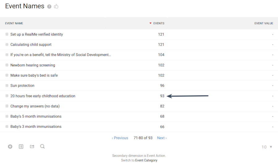
One of the data points we looked at was the number of times an accordion at the top of the page was opened versus an accordion at the bottom of the page. The below images show the difference: during the same time period an accordion at the top of the page, entitled “Becoming a dad”, was opened 1,028 times, while an accordion at the bottom, entitled “20 hours free early childhood education”, which you would assume would be sought after information, was opened only 93 times.


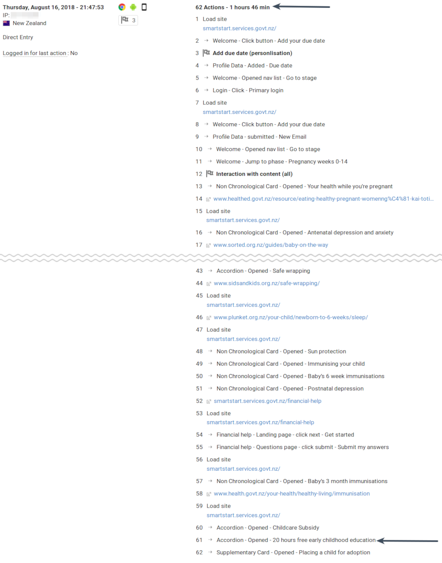
And if we look at the journey of a user who did open the “20 hours free early childhood education” accordion, we can see it took them one hour and forty-five minutes to get there, and they did by looking at nearly everything on the page.

These two pieces of information start to suggest that only our most persistent, or perhaps worried, website visitors are finding all the information available to them. It is important to note here that these assumptions need to be followed up with user research. Simply collecting data will never tell the whole story of a person’s experience, but it is useful to start a discussion.
Surprising findings
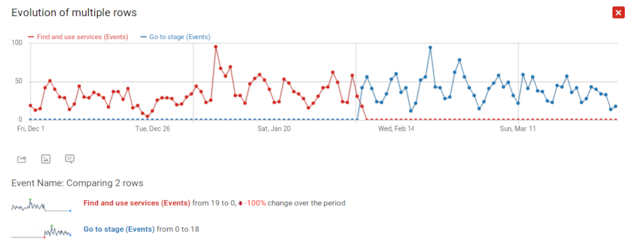
We have also built navigation tools into the welcome page to help our site visitors find relevant information. This is done in the form of a button labelled “Find and use services” that will take them to different parts of the welcome page, depending on what information they are after. We attached a Matomo event to this button to track if people were using it, which people were not.
We then changed the button to “Go to stage”, updated the analytics accordingly, and were able to track the efficacy of this change. The below image shows that simply updating the label of the button did not increase its use. Our change was not effective, which is disappointing but is still really useful information. We now know that we need to make some more fundamental changes to the navigation than simply changing the text on the button.

Web analytics to support UX research
Having data about how people interact with SmartStart has been invaluable in helping us and our client make decisions about the future direction of SmartStart. We can see what information people are looking for, how long it takes them to find that information, and what tools they use or do not use.
Of course, web analytic tools are constantly evolving, and we now have access to plugins that can help us delve ever deeper into how people actually use our sites. These plugins include things like heatmaps, session recording, and A/B testing, all of which are available via Matomo. We will be making use of these in the future, as well as those already discussed. Being able to see how real people navigate and interact with SmartStart helps us improve the application and develop it along the needs of expectant and new parents in Aotearoa.
