
I have been a Moodle practitioner since I first used it for teaching in 2007. It did the job I needed it to do:
- Present information in a structured way,
- Provide a forum space for discussion,
- Allow me to share recordings of practical work conducted by students in class back to them for review and self-reflection.
Fifteen years later I am still in love with Moodle for college and university education and consider it a superior platform to the other popular ones on the market (despite their massive sales budgets and armies of ‘Executive Customer Success Managers’). So I often feel disheartened when I hear people say that Moodle is ‘ugly’, ‘outdated’, and ‘difficult to navigate’.
In my role as a Product Specialist I see many Moodles – some are basic and are pretty much ‘out of the box’ using a core theme. Others have had their own theme developed for them and look glorious. Most, however, use our CatAwesome theme (offered exclusively to our hosted clients) or one of the themes available from the Moodle Plugin database (for free!!!). But under the hood, they are all Moodles, and have the potential to present and facilitate amazing learning experiences.
What do we mean by a ‘Modern LMS?’
I decided to ask ChatGPT (a tool many institutions are concerned about ruining essay-based assignments, and what is likely to be the ‘hot topic’ at every EdTech event over the next five years), ‘What should a modern LMS look like?’, which produced the following output:
A modern learning management system (LMS) typically has a clean, user-friendly interface with a modern design. It is usually responsive, meaning it adjusts to different screen sizes and can be accessed on a variety of devices. The layout is usually intuitive and easy to navigate, with features like a dashboard that provides an overview of the user’s course progress, and a navigationbar that allows users to easily access different sections of the platform.
The colour scheme is usually modern, with a mix of neutral colours and bold accent colours. Many modern LMS are built with a drag-and-drop interface, making it easy for users to customise their pages. Some modern LMS also come with built-in analytics and reporting tools, which help educators monitor and evaluate their student’s performance and make data-driven decisions.
How does Moodle compare?
Many Moodlers reading the AI response will think, ‘hang on…my Moodle already has all of this???’, and I agree! Many of these features have been there for years, as standard, but are deemed newly minted roadmap items for other LMS’s. Let’s take a walk through the key features ChatGPT identified…
Responsive design: ✔️
Moodle is built on Bootstrap – a responsive framework which ensures accessing from a mobile device means no degradation of experience. For those who demand an app – ‘there’s also an app for that’ 😉
Dashboard: ✔️
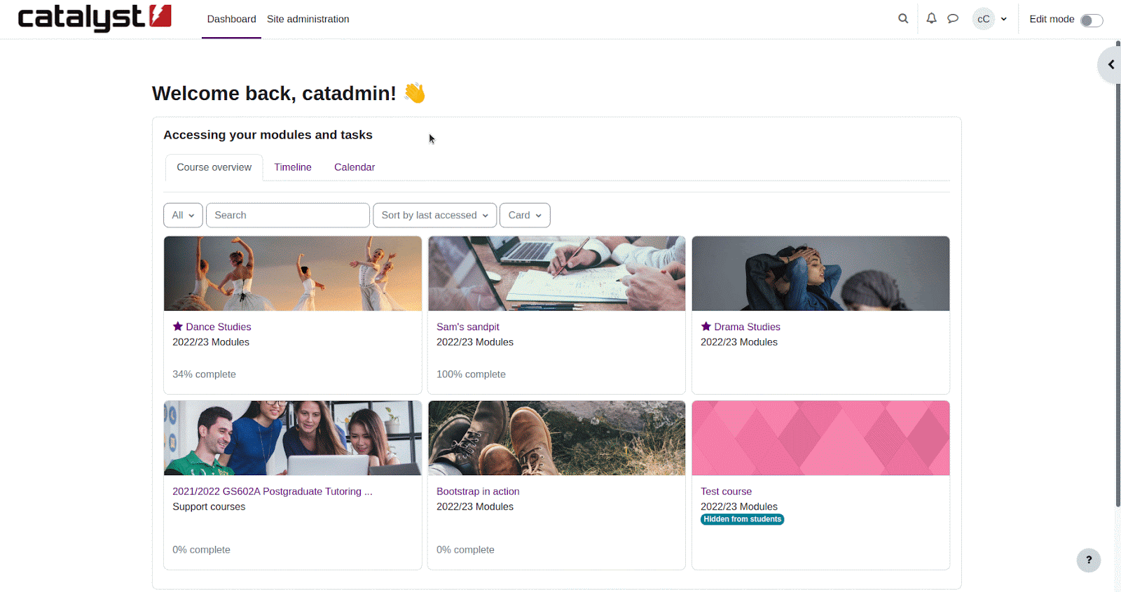
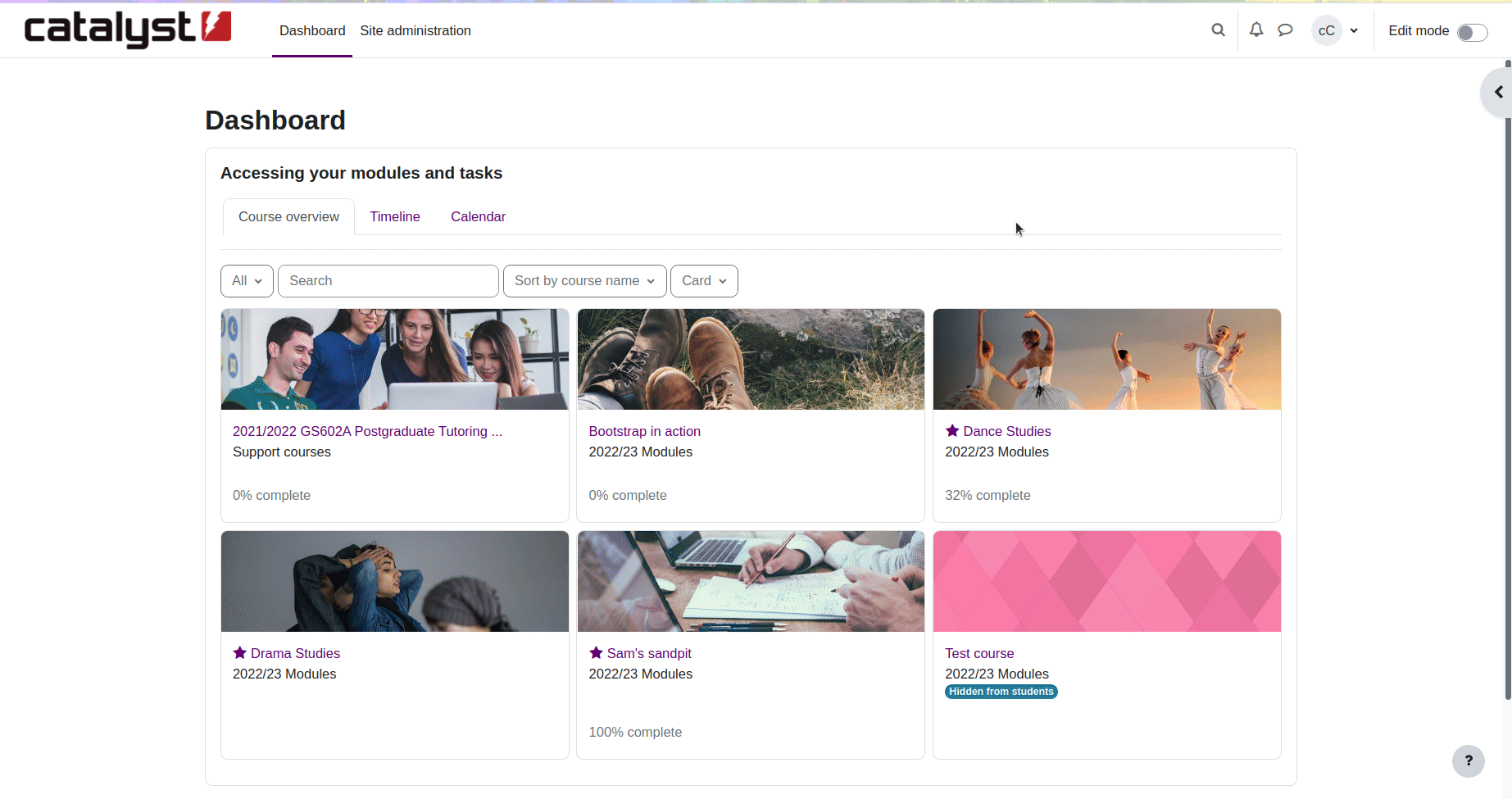
Moodle made massive strides when they introduced the Course overview and Timeline blocks in version 3.4, and Moodle 4 looks even better with the inclusion of the calendar. Learners and educators can configure their Dashboards in a way that helps them to identify courses that need their attention, view a ‘to do’ list with direct links to activities via the timelines, and have a ‘bird’s eye view’ of the spread of activity due dates on their calendar.
Navigation: ✔️
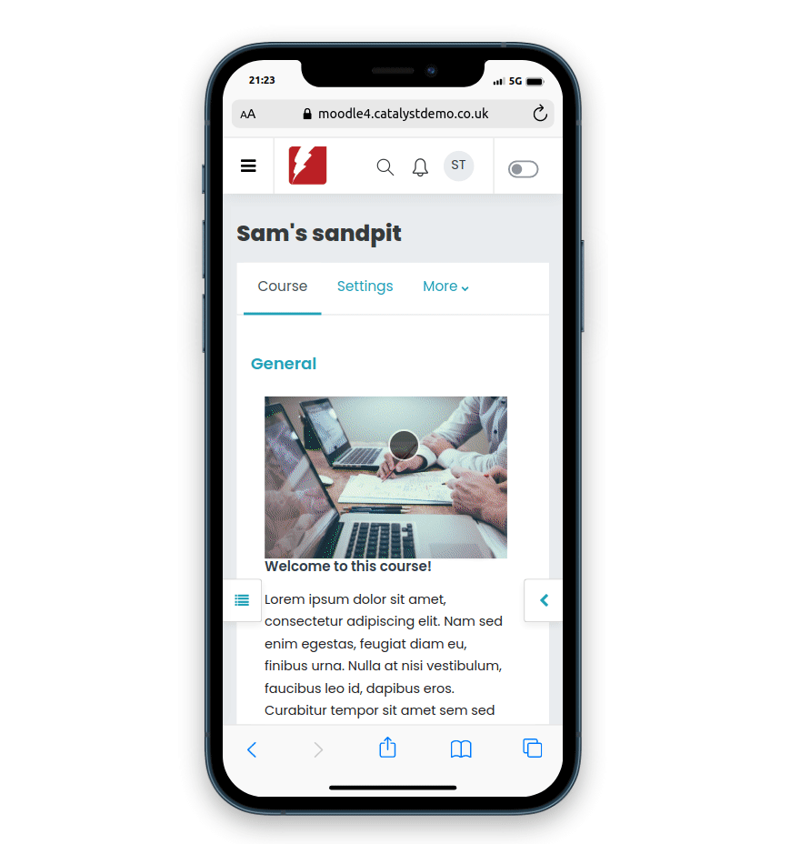
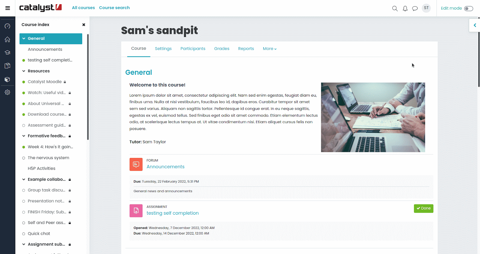
Now, don’t get me wrong, it’s taken me a while to get used to the new Course index side panel, but I have now used it so much I find myself missing it when working in a Moodle 3.9 or 3.11. Using a theme that allows for linear navigation (like in Boost Union and CatAwesome) as well as the course index makes finding what you need even easier.
Colour scheme: ✔️
Ok, so I’m taking this to be all about theming? In all out-of-the-box Moodles you can pick your brand colours. Beyond that, there are also themes that are freely available from the Moodle Plugins database or can be custom-made. The colour of your Moodle is totally in your hands (well, probably more like your marketing team’s hands), and depending on which theme you choose, you have the power to set the default colours for a number of features.
Drag-and-drop interface: ✔️
Ok, so you can only drag sections and existing activities and resources around, as well as drop files into a Moodle course at the moment, but the Activity chooser is still a great feature. It is configurable by site administrators who have the power to hide modules if they feel they won’t get used (I have heard Moodle offers too many choices???). In two clicks you can configure the module of your choice, hit save and then it’s there on your page.
Also, as someone with course editing rights, you can configure your own activity chooser tool too, to show only the modules that you want to see.
Built-in analytics and reporting tools: ✔️
I was aware of course reports and the Gradebook back when I was a college lecturer in 2007. I could see the course logs of who had logged in and who hadn’t (lack of online engagement back then was due to not booking out a computer in the Learning Resource Centre in time, as most of my learners did not have a computer at home, never mind access to the internet). Nowadays we can use the Activity completion features in all Moodle activities to monitor engagement and progress. Moodle 4 brought with it its new Custom reports tool which shows promise. But for us at Catalyst, and for many of our clients, the Configurable reports plugin does exactly what they need it to do, and when it doesn’t we can build them their own bespoke report. Their data, their site, and their own bespoke report. Now, how good does that sound?
Another feature or requirement that I want to bring forth, that wasn’t in the ChatGPT response, is Accessibility. Moodle really cares about Accessibility and has a number of built-in features such as the Accessibility toolkit, developed by Brickfield Education Labs that can help lecturers improve their current practice and understanding. Institutions who really want to invest in accessibility can upgrade their toolkit to the Enterprise version which gives them additional reports and features such as document conversion, which is amazing! I know many of the universities that we host have either signed up for the full package or are looking into it, which is really encouraging to hear.
What does this all mean?
I know a lot of what I presented above was a bit tongue-in-cheek, especially as I asked an AI tool to give me a definition of a ‘Modern LMS’. I’m sure if I refreshed my submission I would have been given a different answer, but in all seriousness, none of the above has anything to do with good learning design, which is what we should really be focussing on. A well-designed course that effectively utilises the collaborative, reflective, evaluative and communicative tools within it will undoubtedly keep learners engaged and invested. And Moodle has many core tools that can do this, as well as hundreds more built by a global community of developers (again – FREE!). I should also mention the extremely useful H5P toolkit that is also freely available as part of Moodle core or as a plugin (so no licence fee!), which can be used to create great digital content. So ease of use (check), quick to create and access content (again, check) and monitor engagement (check check check) are all in there as standard. If you have too many choices, just switch them off in the settings.
So please, don’t call Moodle ‘ugly’, ‘outdated’ and ‘difficult to navigate’ – it’s highly configurable, and a good Moodler or Moodle partner (like us) can help you set it up in a way that suits your needs.